I grew up going to church every Sunday. I went to a Freewill Baptist church, and we had the same hymnal that every other church in our denomination had. Those song books lasted for decades. One downside to the endurance of the hymnal is the difficulty of adding new music into the weekly service.
In college I went to a different, more modern church. By “modern” I mean they had no hymnals. Instead the song leader stood beside an overhead projector and changed hand written transparencies as the singing advanced to a new verse or song. This worked well because the song leader actually controlled the advancement of the words and he was very good at keeping us on the right page. Occasionally, the words were difficult to read, but the technology did provide a nice amount of flexibility in the worship.
In graduate school I went to a much larger church with even more advanced technology. All the songs had been printed and photographed using 35mm slide film. The negatives were mounted in 35mm slides where the words were white on a black background. This arrangement worked well outside of the occasional upside-down slide. The sanctuary held more than 1000 people and all could easily read the words.
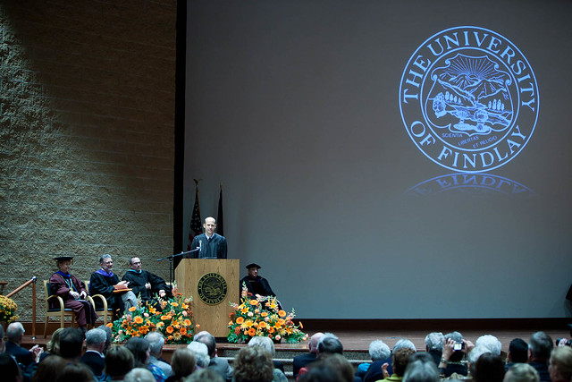
Today my church uses a projection system much like most classrooms have. Our screen is huge as it is the whole back wall of the stage. Here is a picture from a UFindlay event at the Winebrenner Theological Seminary, in the room where we have our weekly church service.
With this big screen, we can project much larger images which means that smaller words are easier to see. Normally, in order to read words on a slide a font size of at least 32 pt has to be used. To determine the size of text you need, try to read everything while standing behind a back row pew.
There are two critical requirements when using a projection system for group singing.
1 – The words on the screen must match the words being sung by the song leader.
2 – The slides must be legible.
That first one is probably the more difficult one to manage. I have seen remote clickers used effectively as long as the song leader doesn’t get clicker-happy. More often there is a second person manually advancing the slides, keeping pace with the song leader. If this is your situation, have the slide advancer practice with the song leader so there are no signs and wonders. That’s where the song leader gives signs to the projection booth and the computer operator wonders what they mean.
Creating slides that are legible is easy, depending on how sophisticated you want to make the backgrounds. The most important thing on the slide is the words. The congregation must be able to read them. A slide like this makes reading the words easiest.
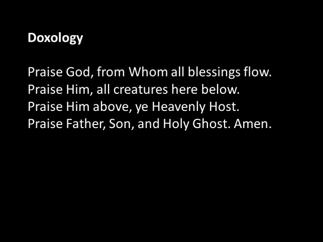
Here are a couple of things about formatting a slide. Align the words on the left side. This makes the words easier to read than centering them. I prefer white words on a black background. The black background will have less effect on the ambient light in the room. If you have a dark sanctuary and a slide with a white background,
you could make the whole room seem too bright, especially when the next slide has a dark background. You may end up with a strobe light effect.
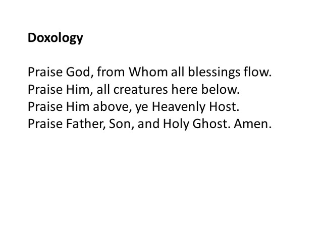
A black background will have the opposite effect of what you see on this written page. Notice how the edges of the black background above are well defined and the white background seems to disappear onto the page. When you project these two slides, you will see the opposite. A white background will have a distinct edge where the light ends while the black background will not. Using a black background will make the words appear to be writing on the wall.
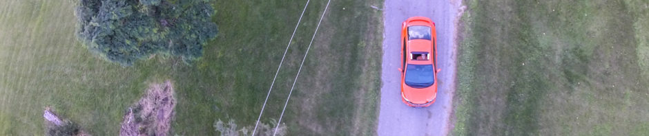
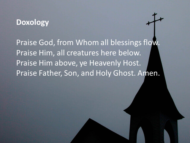
If you wish to have a picture on the background, go back and read the second rule. Below is a slide with a nice background showing a church as viewed from above.
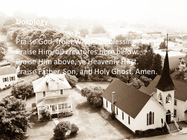
Some of the words are easy to read, while other parts are difficult if not impossible. I have seen backgrounds like this used with drop shadows (as below)
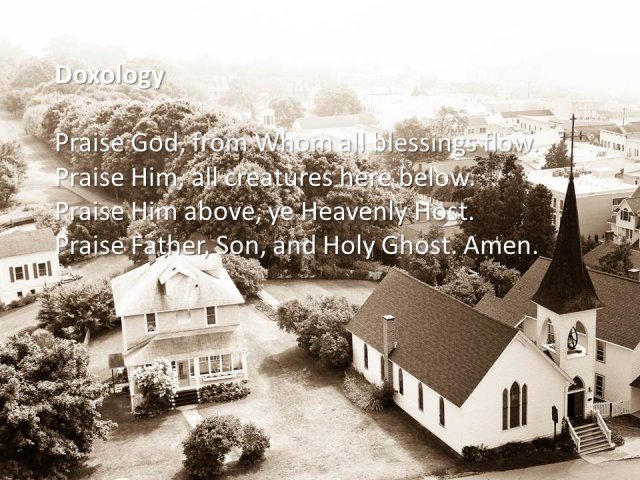
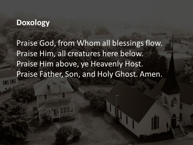
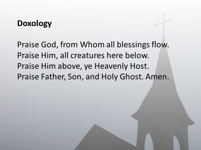
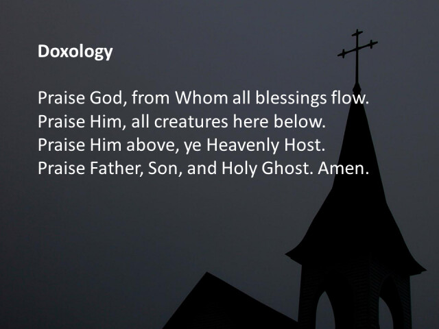
with some success, but it is still difficult to read the words on parts of the slide. The words are difficult to read because there is little contrast between the words and the background. Contrast is what makes the white words on the black background easy to read. You can increase the contrast by darkening or lightening the background as below.
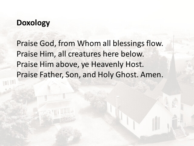
Another solution is to use a picture with a large area of light or dark space. Here is a picture of the same church but from a different angle.
You do not have to be a Photoshop expert to change the lightness or darkness of the background picture. PowerPoint and Keynote have tools that make it easy to do these things. Here is the same picture in a lighter and darker version.
I recommend testing a few different settings to determine the one that works best for your sanctuary.
Last week I started a new 52 project. During the next year, I plan to photograph something weekly which can be used as a church slide background and post it to my Flickr group. If you are interested in joining us, the group is here
http://www.flickr.com/groups/church_slide_backgrounds
If you create slides for your church, please feel free to use the pictures we have. All the pictures are licensed Creative Commons, so you do not have to gain permission of the owner to use them.
3 Responses to Backgrounds for church slides