CRAP. Every great PowerPoint has lots of CRAP.
Contrast
Repetition
Alignment
Proximity
All four elements are important in a great PowerPoint, but contrast is far and above the most important component of any single slide. Without contrast there is no way to distinguish between the message and the background. You do not want your message to be lost in the background.
In an ideal world everything would be black and white. These colors have the most contrast. But the world has all colors and people like to use different colors in presentations. Below is a series of pictures showing different color combinations, starting with the generic black and white.

The picture above alternates between white on black and black on white. Depending on the display environment and the other slides in the deck, one of these combinations is usually easiest to read. I prefer a black background with white text because the focus is on the brightness of the text. In a dark room, a white background can cause the audience to squint which makes the text more difficult to read.
Our school colors are blue and red. Below are two versions of a slide using these colors.
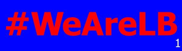
The first color combination is the default blue and red. The colors have the same value and because of this, they lack contrast. The edges around the words almost glow and it makes the text difficult to see. The second version is dark blue and light red. The color combination is similar to the first slide, but with greater contrast. It makes the words easier to read.
With solid colors, select a light and dark combination for better contrast. If a picture is in the background, it gets more complicated. We use the eagle logo as the background on many slides.

This logo has dark and light colors. If text is placed over the logo, areas will have poor contrast no matter what color is used for the text. The solution is to layer a slightly transparent dark rectangle between the logo and the text. Below are three slides showing the different combinations.
![]()
The initial slide has the text directly on top of the logo. The next slide has a transparent layer covering half of the logo. The final slide has the transparent layer covering all of the logo. The transparent layer is a black rectangle with 50% transparency. Using this simple technique, the logo is visible with good contrast between the text and the background.
If you drive past the school, you will see this very slide at the end of each day’s schedule. The message is clearly visible and the school logo ties it all together. Good contrast is the key.