I use the same password everywhere

I am surprised by the number of people who tell me they use the same password for nearly everything. Even if the password is a strong password this is still incredibly insecure and most people do not realize why.

If I reuse a password on multiple sites and just one of those sites is compromised, my one password is known by a bad actor.  If that password is used for an email account or online storage, all my data could be deleted.  If I use the same password for anything that has money attached to it, Amazon, iTunes, bank account, etc., it could be a costly mistake.

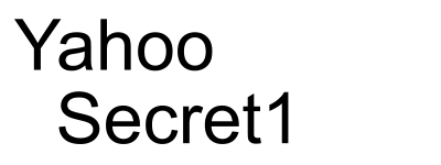
I have used the same password on most of my sites for many years, but that password is altered so that each site appears to have a unique password.  Let me explain how it works by showing how my password at Yahoo compares with my password at Google.

For this example, let us make my password

Secret1

If I mix my password with the site I am logging into in such a way that I can reproduce the process in the future, I can come up with a unique password for each site I login to. Here is a simple “hash” of the site and my password.  Take the first letter of the site followed by the first letter of my password, and continue to alternate letters from site and password until a “hash” is created.

For Yahoo my password would be

YSaehcoroet1

For Google my password would be

GSoeocgrleet1

This is called a hash.  A hash is a combination of two pieces of data that always produces the same final string of characters.  This example alternates letters from the site and letters of my password.

My example hash is simple and someone who has access to my final password would be able to reverse engineer it to determine the master password component of my hash.  Then they would be able to use this hash anywhere I use it.

Fortunately, there are many cryptographically strong hash functions available.  A strong cryptographic hash cannot be reverse engineered to come up with the original master password.

Here is an example that can be embedded into a web site.

https://gist.github.com/windows98SE/cc024ffb4cf501358edc

I have embedded this hash algorithm into this page.

https://www.trustyetc.com/password

When I use Yahoo for the Site URL and Secret1 for the Master Password, the resulting hashed password is

6D97cDf17270

Try it yourself.  You will get the same hash as I did with this combination.  Keep in mind, both the URL and the password are case sensitive.  Now compare the hashed password for Yahoo and Google

6D97cDf17270
62C36b6F50f1

Other than the first digit being the same, there is no similarity in the two hashes.  Look at this string of password hashes for Yahoo where Secret1, Secret2, Secret3, Secret4 and Secret5 are used respectively.

6D97cDf17270
692BeDc3Af30
65D98a7D9bF3
48F486d92533
70328C6c69Ba

Even though only one letter is changed in my master password, each hash is completely unique.  This is a property of a good cryptographic algorithm.

So it is safe to use one password on all your sites, as long as you run that password through a good hash beforehand.


Posted in edtech, education | Tagged , , , , | 1 Comment

Contrast Contrast Contrast

CRAP.  Every great PowerPoint has lots of CRAP.

Contrast
Repetition
Alignment
Proximity

All four elements are important in a great PowerPoint, but contrast is far and above the most important component of any single slide.  Without contrast there is no way to distinguish between the message and the background.  You do not want your message to be lost in the background.

In an ideal world everything would be black and white.  These colors have the most contrast.  But the world has all colors and people like to use different colors in presentations.  Below is a series of pictures showing different color combinations, starting with the generic black and white.

The picture above alternates between white on black and black on white.  Depending on the display environment and the other slides in the deck, one of these combinations is usually easiest to read.  I prefer a black background with white text because the focus is on the brightness of the text.  In a dark room, a white background can cause the audience to squint which makes the text more difficult to read.

Our school colors are blue and red.  Below are two versions of a slide using these colors.  

The first color combination is the default blue and red.  The colors have the same value and because of this, they lack contrast.  The edges around the words almost glow and it makes the text difficult to see. The second version is dark blue and light red.  The color combination is similar to the first slide, but with greater contrast.  It makes the words easier to read.

With solid colors, select a light and dark combination for better contrast.  If a picture is in the background, it gets more complicated.  We use the eagle logo as the background on many slides.

This logo has dark and light colors.  If text is placed over the logo, areas will have poor contrast no matter what color is used for the text.  The solution is to layer a slightly transparent dark rectangle between the logo and the text.  Below are three slides showing the different combinations.

The initial slide has the text directly on top of the logo.  The next slide has a transparent layer covering half of the logo.  The final slide has the transparent layer covering all of the logo.  The transparent layer is a black rectangle with 50% transparency.  Using this simple technique, the logo is visible with good contrast between the text and the background.

If you drive past the school, you will see this very slide at the end of each day’s schedule.  The message is clearly visible and the school logo ties it all together.  Good contrast is the key.


Posted in edtech, education, presentation | Tagged , , , , | Comments Off on Contrast Contrast Contrast

Merry Christmas!

Trusty Christmas Card 2017
Merry Christmas! We feature Ohio State’s newest recruit in our Christmas picture. Congratulations Maria! It’s also Taffy’s tenth Christmas.

Posted in leisure, photography | Tagged , , , , , | Comments Off on Merry Christmas!

SignCommand Good, PowerPoint Better

This fall, Liberty-Benton installed an electronic sign in front of the high school.  I was asked to help with the management of the content that is displayed on the sign and to train others who would help with content creation.

The software that came with our sign is SignCommand.  It is web-based and comes with 178 pre-programmed animations.  It is not possible to edit the animations or customize them in any way.  A large proportion of the animation library is church, retail and organization specific.  There are some generic animations that say things like “don’t drink and drive”, “don’t text and drive”, and “speed a little, pay a lot”.. Most importantly, not a single animation in the library says “Liberty-Benton” on it.

Most of the animations in the SignCommand library are eye-catching.  Text pops on the screen and the background moves around.  They were probably created with a 3D animation program, but no one at my school has experience using 3D software.  On the other hand, everyone knows how to use PowerPoint.  To me, this was a problem most easily solved with PowerPoint.

The sign will accept content in the form of an MP4 movie.  Since a PowerPoint slide deck can be exported as an MP4, there are minimal extra steps to go from PowerPoint to the sign.

I created an LB PowerPoint template that was the correct size.  The template also includes example text that is adequate size for legibility on the sign.  You can see from the picture above, the sign has very low resolution.  If you count the pixels, there are only 32 from top to bottom.  Left to right there are only 112 pixels.  How big is that?  Here is a picture that is 112×32 pixels.

When I created a PowerPoint slide that looked like this.

It looked like this on the sign.

You can see that it is a bus, but most of the detail beyond that is lost.

I found that fonts formatted to 150 points on the provided template were large enough to easily read on the sign.  At that size, two lines of text can be displayed on one slide, and about eighteen characters fit on one line.  We use a few acronyms to make it work.

JH Girls Basketball
9th Boys Basketball
ES Movie Night

Most of the slides are programmed to advance after three seconds.  At that rate, we can cycle through two day’s worth of events in the time it takes for the red light to change to green at the intersection beside the school.

I plan to create several posts in a series explaining how we create content for our sign using only PowerPoint.  Stay tuned.

Posted in edtech, education, presentation | Tagged , , , | Comments Off on SignCommand Good, PowerPoint Better

Ten Years of Scratch

Scratch Banner

Ten years ago, I was teaching a multimedia graduate class in which we were looking at different multimedia environments that could be used to develop educational content.  The course culminated with an Adobe Flash project, but we explored other applications along the way.

One of those applications was Scratch and I wrote about it back then.  At the time, Scratch was a program that was downloaded and used offline.  Finished projects could be uploaded to the web site for sharing.  You could also download projects from the website and remix them using the desktop application.  About four years ago, the Scratch programming environment went online.  Since that time you can do all your coding using only a browser at https://scratch.mit.edu.

There are several things about Scratch that make it an excellent place to learn to code.  One of the most important is the price.  Scratch is completely free.  There is no required software installation because everything is done in a browser.  If you can get online, you have full access to all the features in Scratch.  If you do not have Internet access, you can still download the application and do the same activities offline.  Anything created with the application can be uploaded to the website when you do get online.

Students can be successful with Scratch right away.  Scratch has a section called tips with tutorials and PDF guides.  There are thousands of Scratch tutorials on YouTube.  A student can start with a guide that introduces the programming environment, shows how to create content and share that work with others online.  Students can create and publish simple projects in one class period.  Last year, my wife and I worked with a group of elementary students at her school.  We developed an activity where participants created a game.  It was a simple game where the player moves an object along a path to a “treasure” at the end of the path.  Touching the treasure wins the game.  By adding a timer, it became a game where users could compete for the best time.  We had a computer lab full of kids and they created their own game in one hour.  It was a simple project with detailed instructions, but every student who wanted to complete it did so.  Some of the excited kids came back the next day and told my wife they had worked on their game at home and added extra features.

The ability to share projects with other people is one of the most powerful features of Scratch.  This has two advantages.  A student can make a project with a specific target audience and then share that project with that audience.  For instance, a student can make a birthday card for grandma and then send grandma the link.  All grandma needs is a browser and she can see the card and hear her granddaughter talking.  More importantly, since all projects are “open” to all users, a student can look at all the code from any project to learn how specific programming problems can be solved.  A student can take any existing project and “remix” it to make something new.  Consider this Origami project.  It has been remixed more than 3000 times. If you look at the remixtree, you will see that the Origami project is actually a remix of another project.

Finally, Scratch is powerful.  You can program anything from a game of checkers to a fully functional flight simulator.  The graphics editor has both bitmap and vector editing capabilities.  If you want to import graphics from an advanced program like Illustrator or Photoshop, you can do that too.  You can also generate graphics as part of the programming, as in this SpiroGraph project.

Each year, we participate in the Hour of Code project.  Some of our students program with Scratch during the hour of code using activities shared on the site.  This year, some of our high school students are creating activities in Scratch that can be used by younger students during the hour of code.  A project like this permits us to use Scratch at every level.  Older students create Scratch modules that younger students can use to make new Scratch projects.

If you have an idea for a project, you can probably find something similar to use as a starting point.  I found this Asteroids game and used some of the spaceship navigational controls in my own version of the game.  I called it Ionoids.  Different ions are randomly generated and you must “shoot” them with the proper ionic charge to destroy them.  All of the graphics were created in Scratch.  I shared it with students who tested it and made suggestions on improvements.  The finished product is used by the science teachers as a fun way to help the students memorize the common charges for ions.  Scratch gave me an environment that I could use to quickly create this project.  I don’t think I could have done it without Scratch.

Now if you Google “ionoids”, my project is the first thing you see.

All my projects are here.

https://scratch.mit.edu/users/trusty/projects


Posted in edtech, education | Tagged , , , | Comments Off on Ten Years of Scratch