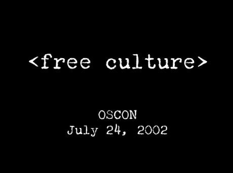
After watching the Free Culture video again, and reading a little more about Lawence Lessig, I have determined that he has his own established “style” of presentation. He uses a minimalist approach where only one word, or at most a short phrase is used on each slide. Lessig uses few graphics. The font always looks like something created by an old typewriter. He also uses white letters on a black background. With this approach, he is forced to create many more slides than most people use in PowerPoint. The above presentation is 243 slides and he presents them in about half an hour.
I have adopted several of Lessig’s stype ideas into my own presentations. I like the rapid-fire, more-than-three-slides-a-minute pacing. One mistake many people make with PowerPoint is putting too much information on one slide. By typing fewer words on the screen, the presenter must avoid the “read it off the screen” presentation style. Nothing is worse than a presentation of paragraphs of text unless the text is read word-for-word to the audience. This leads to Death By PowerPoint.
Having a lot of slide does something else, especially if you are a first-time presenter. When you are nervous, you tend to speed up your talking and move through the slides quicker. With a presentation with a lot of slides, you will need to move through them faster and your “nervous pace” won’t be as noticeable.
I do use many graphics in my presentations. The topics I cover (educational technology) tend to require more pictures. I don’t use clipart-for-the-sake-of-clipart to fill in white space on slides that are all text. Most of my pictures are screen captures that show specific software or uses of that software.
If you are looking for an excellent source on presentation styles and mechanics, check out Presentation Zen.

Pingback: Alvin’s Educational Technology Blog » No Magic Bullet